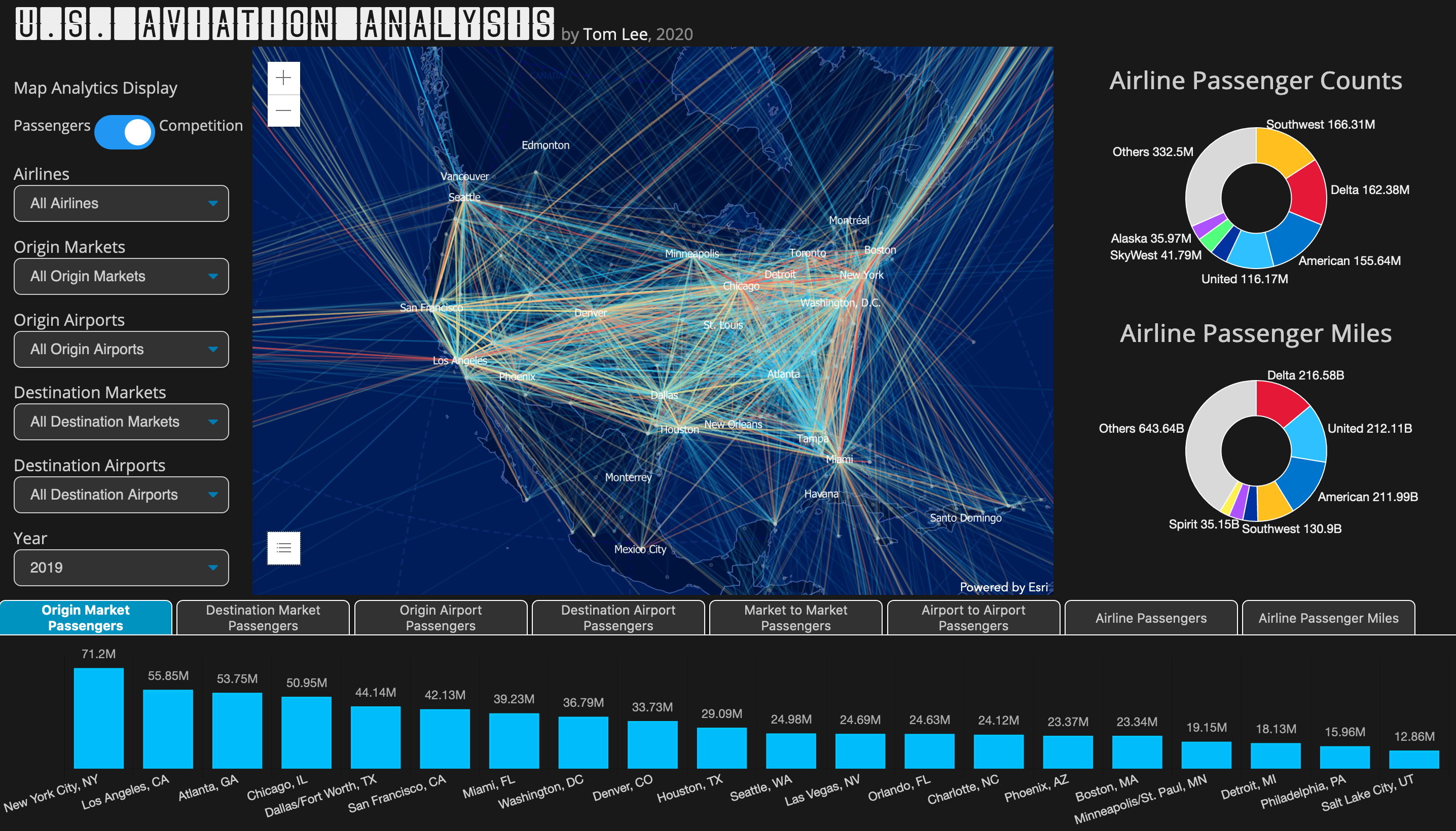
JavaScript analytics and visualization app
Analyzes annual U.S. domestic and international passenger counts by airline, route, and year using data from the U.S. Department of Transportation T-100 database. Built using the ArcGIS JavaScript API and Chart JS, with data hosted on ArcGIS Online and the website hosted on GitHub Pages.
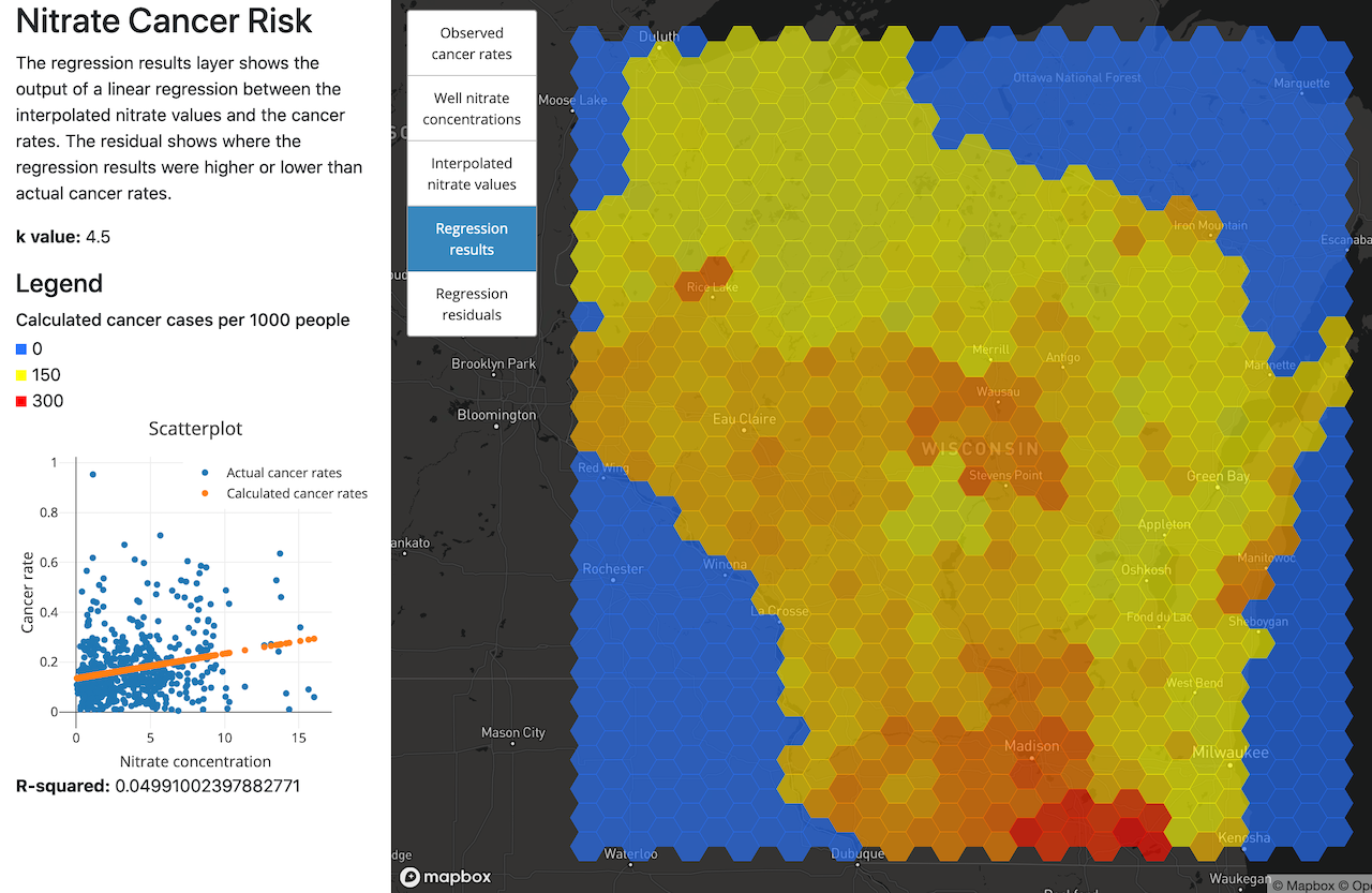
MapBox GL and Turf.JS geospatial analysis app
Investigates the spatial relationship between well nitrate levels and cancer rates in Wisconsin.
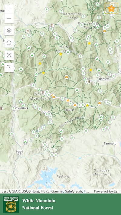
ArcGIS JS national forest map application
White Mountain National Forest Discovery App. Users can explore the park by browsing, searching, and reviewing locations. Built using the ArcGIS Javascript API with data stored on a Postgres database.
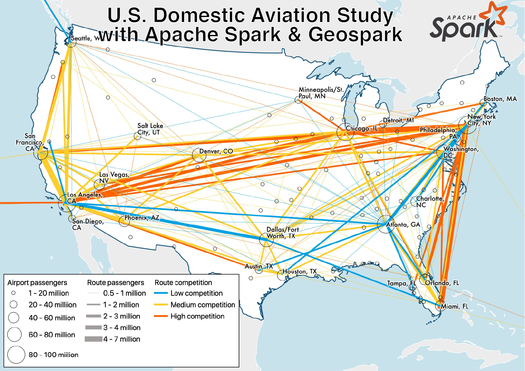
Apache Spark Geospatial Analysis
Geospatial analysis of U.S. domestic aviation market using Apache Spark and Geospark package. Full paper available here.
ArcGIS JavaScript API web map app
Wildlife tracker web mapping application where users can create, edit, and filter wildlife reports.
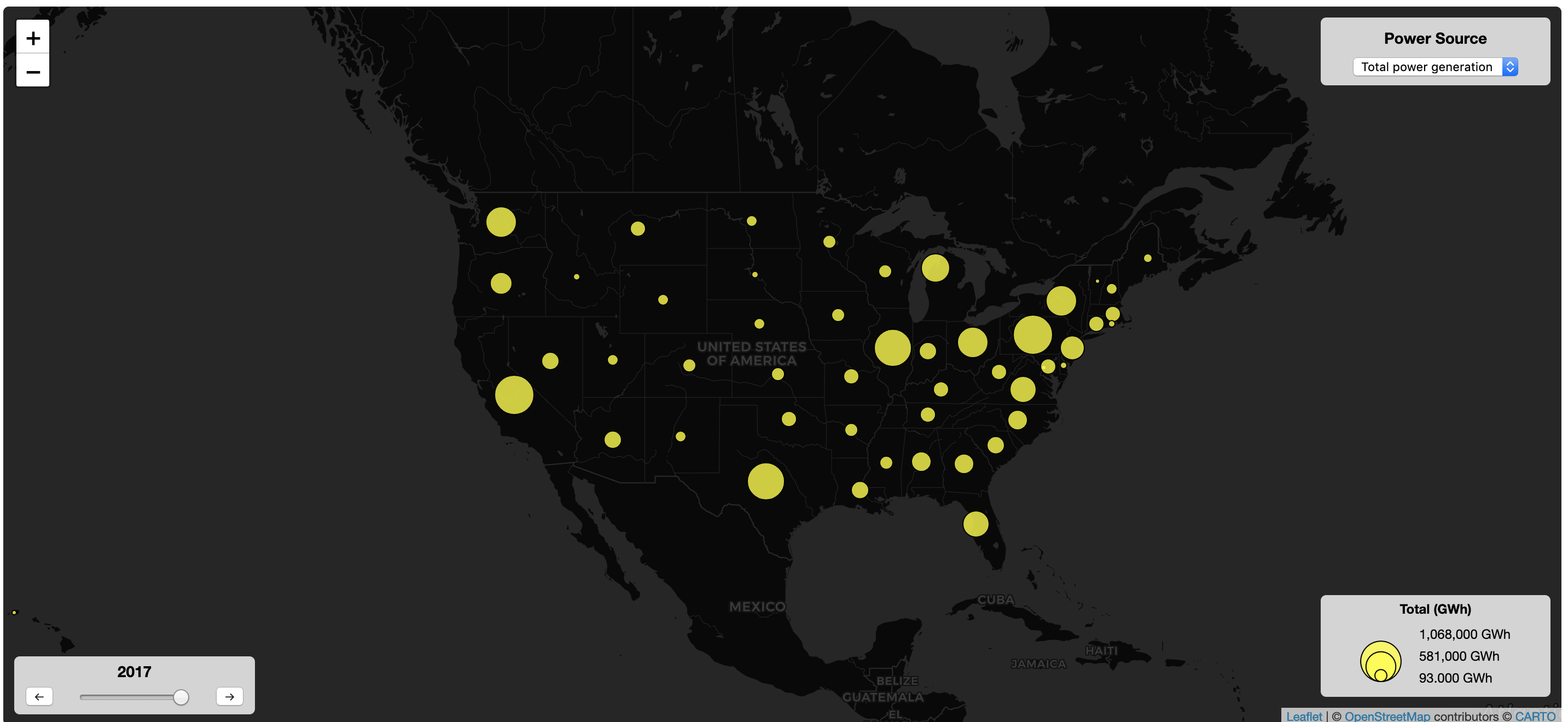
Leaflet interactive web map
A interactive map of state power generation by year source. You can change the year and power source type using the controls.
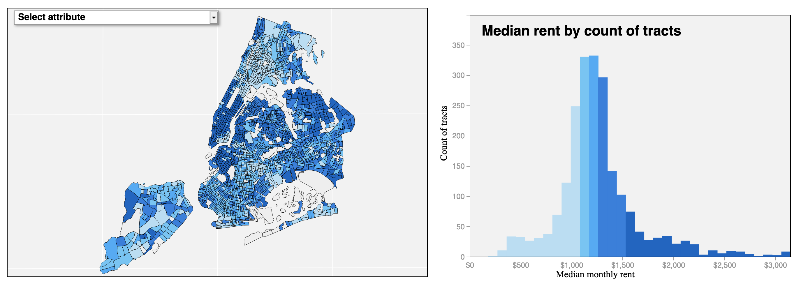
D3 Coordinated Visualization
This visualization was created using D3 and shows rental & ownership costs in New York City. Users can hover over a tract on the map and see the corresponding bars on the histogram and vice versa.
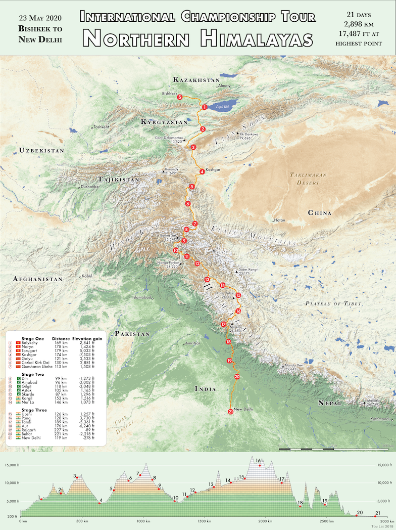
ITC - Northern Himalayas
A terrain map showing a fictional cycling race route across the Northern Himalayas. The map uses an NDVI image to show the variation between deserts, low forests and high mountain tundra. It also includes hillshading to show the dramatic terrain and calls out some of the world's highest mountains.
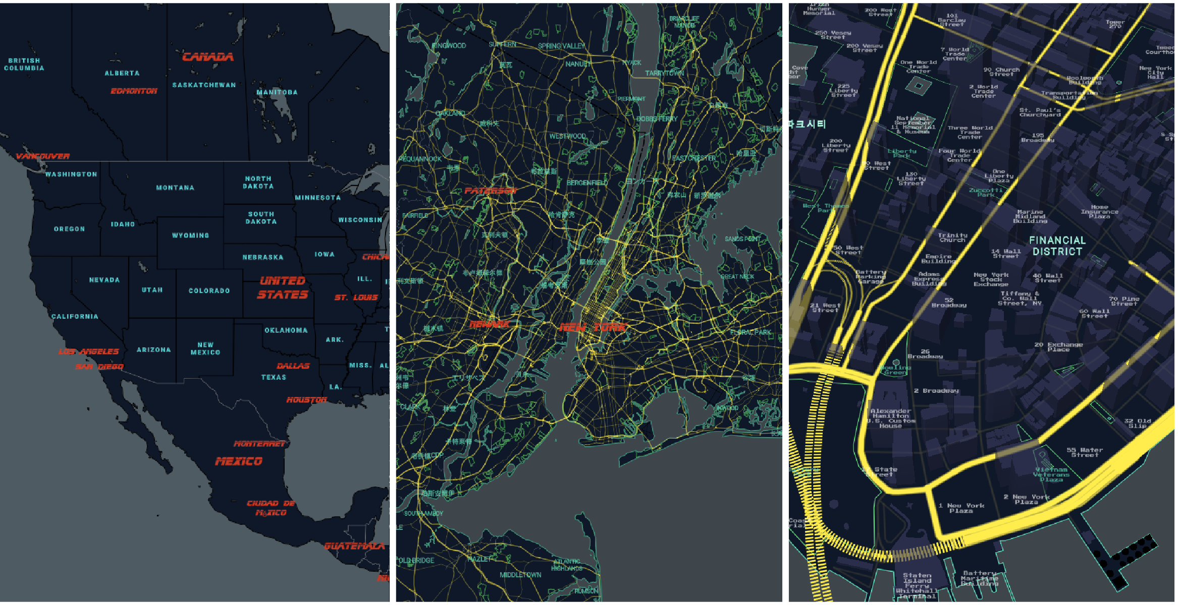
Custom Web Map Tileset
Mapbox vector webmap tileset based on the 1982 Blade Runner film. Custom layers and styling was used to recreate the theme of the film. Check out the final product here.
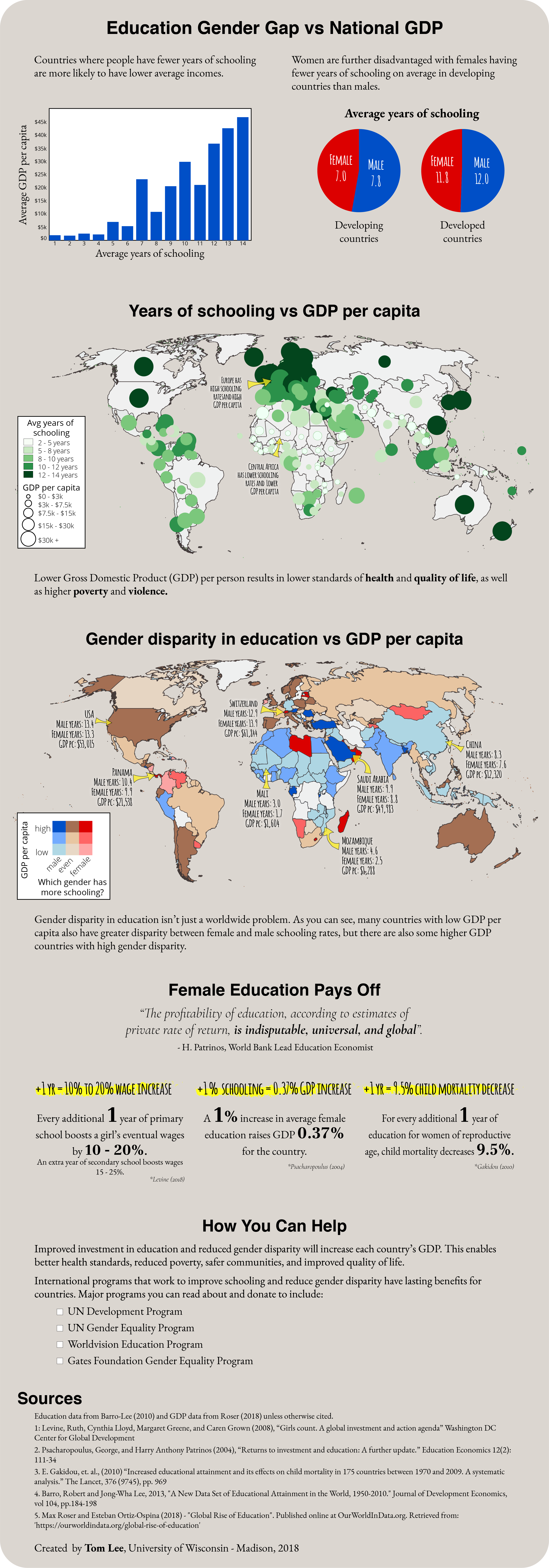
Education gap vs GDP
This infographic shows the realtionship between education, gender and GDP for each country. It presents data from the UN education and gender equality programs in graphs, charts and maps to help the reader explore the data. The focus of the infographic is a multivariate choropleth map that symbolizes two variables, GDP and gender gap per country, so that the reader can easily compare the two on the map together.
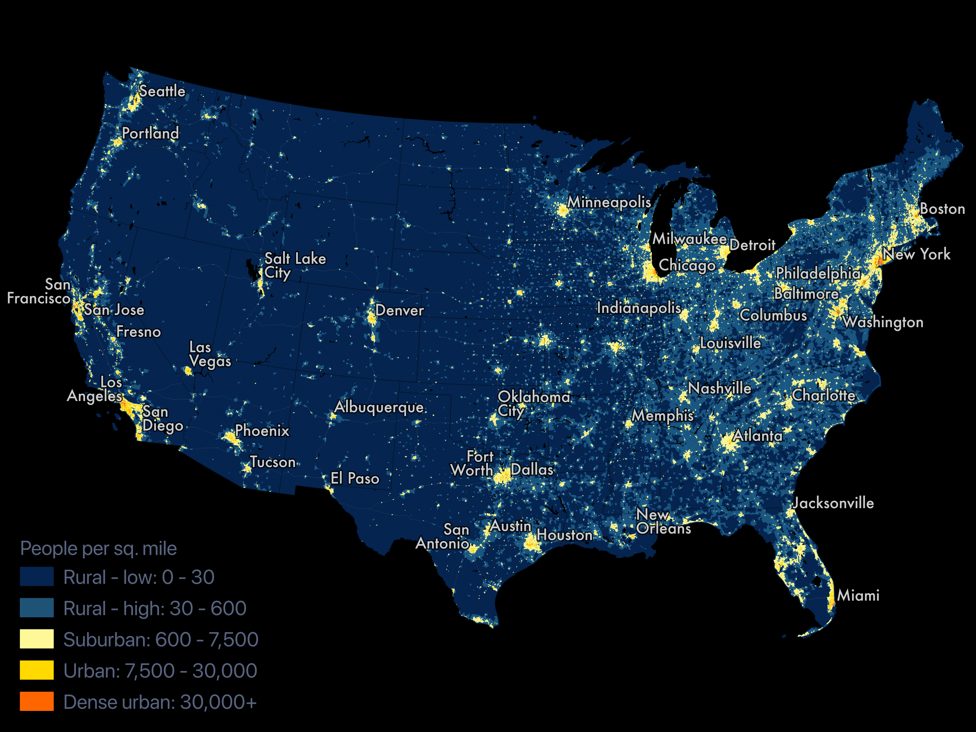
U.S. Population density
Quick map showing census block group population density for the USA. Data was sourced from the Census Bureau's 2017 American Community Survey that includes many demographic measures down to the census block group level.